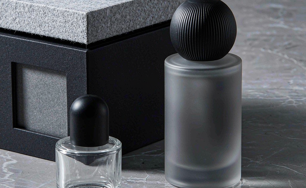
Gender-neutral fragrance packaging has moved from niche experiment to mainstream strategy. Brands launching in 2026 increasingly default to unisex positioning because it doubles addressable shelf space and aligns with younger buyers who reject traditional masculine or feminine cues. But making a perfume bottle look “for everyone” is harder than removing the color pink. A truly unisex design must feel intentional, premium, and flexible enough to carry different fragrance stories.
This guide is written for buyers, brand managers, and cosmetic packaging purchasers who are sourcing custom perfume glass bottles for gender-neutral lines. We cover the design rules that work, the mistakes that kill a launch, and the manufacturing realities that decide whether a beautiful concept survives production.
Why Gender-Neutral Packaging Is Now a Default Strategy
The global fragrance market has shifted. Unisex and gender-fluid scents now represent a meaningful share of new launches, especially among indie brands and direct-to-consumer labels. Retailers respond by placing these products in open-plan displays rather than segregated men’s or women’s sections. That changes the design brief.
A gender-neutral bottle must:
- Read as premium from a distance without relying on gender-coded ornamentation.
- Work under multiple lighting conditions and retail layouts.
- Allow seasonal limited editions without a full redesign.
- Appeal to both online shoppers scrolling thumbnails and in-store testers.
The payoff is operational. One bottle platform can serve multiple scent SKUs, reducing mold investment and simplifying inventory. If the base design is right, a brand can launch four fragrances using the same glass with different labels, caps, and secondary packaging.
The Core Design Rules for Gender-Neutral Fragrance Packaging
1. Start with Geometry, Not Ornament
The safest starting point for gender-neutral fragrance packaging is balanced geometry. Cylinders, rectangles with rounded corners, and vertical oval columns all communicate neutrality because they avoid the exaggerated curves or heavy shoulders often coded as feminine or masculine. This does not mean boring. It means the visual interest should come from proportion, material weight, and finish rather than from applied decoration.
A common ratio that works across sizes is a height-to-width ratio between 2.8:1 and 3.2:1. That range feels slender enough for premium positioning without becoming fragile. For a 50 ml perfume bottle, that translates to roughly 85 mm tall and 27–30 mm wide.
2. Use Color as a Signal, Not a Statement
Neutral palettes dominate successful unisex launches: amber, smoked grey, frosted white, matte black, and sage green. These colors read as modern and clean without leaning on gender stereotypes. The key is restraint. A single dominant color with one accent finish performs better than multi-color gradients in this category.
If the brand plans to launch multiple scents, consider a color family rather than unrelated colors. For example, a gradient from clear to charcoal across four SKUs creates shelf rhythm while keeping each SKU distinct. Our team has found that silk screen printing is the most reliable way to apply matte opaque color on gender-neutral bottles because it delivers consistent coverage and clean edges.
3. Let the Cap Carry Personality
Because the bottle body stays neutral, the cap becomes the main personality piece. A heavy zamac cap adds gravitas. A matte ABS cap with a soft-touch coating feels contemporary. A wood or cork-accented cap signals natural positioning. The cap is also the easiest component to change between limited editions.
Cap proportion matters. A cap that is too tall relative to the body looks top-heavy. A cap that is too short looks cheap. A good rule of thumb: the cap height should be 18–22% of the total bottle height. For an 85 mm bottle, that is approximately 15–19 mm of exposed cap.
4. Prioritize Tactile Finish
Gender-neutral fragrance packaging often relies on touch as much as sight. frosted glass, soft-touch coatings, and micro-etched surfaces invite handling. In a retail environment, the bottle that gets picked up is the bottle that gets purchased. A tactile finish also photographs well because it reduces harsh reflections.
One effective combination is a frosted cylindrical body with a satin metal cap. The contrast between matte glass and polished metal reads as premium without being flashy. If budget allows, gold foil stamping on the shoulder or base adds a small luxury cue without dominating the design.
5. Keep Typography Clean and Scalable
The label or direct print should use a single strong type family. Sans-serif logos dominate gender-neutral fragrance packaging because they feel modern and unisex. Avoid script or overly decorative fonts. The front label should be readable at thumbnail size because most discovery happens online.
Label placement is also a practical concern. A centered front label on a cylindrical bottle will read correctly from any angle. On a flat-fronted bottle, left-aligned labels often look more editorial. Always print a mock label and photograph it on a real bottle before approving artwork.
Common Mistakes to Avoid
Even experienced brands make these errors when moving into gender-neutral fragrance packaging:
- Over-correcting to plain. Removing all cues can leave a bottle looking like a generic sample vial. There must still be one premium detail.
- Ignoring the secondary box. The bottle may be neutral, but a pink or navy box will re-code the gender positioning immediately.
- Specifying fragile details. Thin glass ridges, suspended labels, or floating elements look great in renders but break in fulfillment.
- Forgetting about refill compatibility. A gender-neutral platform should ideally accept refill cartridges or pump replacements to extend lifecycle.
Matching Bottle Shape to Fragrance Category
Unisex does not mean one-size-fits-all. The fragrance category still shapes the bottle choice.
| Fragrance Category | Suggested Bottle Shape | Surface Finish |
|---|---|---|
| Citrus / fresh | Tall cylinder | Clear or lightly frosted |
| Woody / amber | Rectangular with rounded corners | Smoked or tinted glass |
| Floral / soft | Vertical oval | Pearl or matte coating |
| Oriental / spicy | heavy base cylinder | Deep gradient or metallization |
| Aquatic / marine | Frosted flask with rounded shoulders | Sea-glass frosted finish |
Manufacturing Considerations
Gender-neutral fragrance packaging must survive both production and shipping. A few points to lock before sampling:
- Wall thickness. A neutral cylinder with flat panels needs a minimum wall thickness of 3.0 mm at the corners to avoid stress cracking.
- Base weight. Unisex bottles often use a heavier base to signal premium quality. Balance the base with the cap so the bottle does not rock.
- Decoration durability. Matte coatings and soft-touch finishes can show fingerprints. Specify a top coat if shelf display matters.
- Sustainability. Many gender-neutral brands lead on environmental claims. Consider post-consumer recycled (PCR) glass or refillable inner cartridges.
Our standard quality process follows ISO 9001 quality management 9001 guidelines, and we test each finish for adhesion, abrasion, and thermal shock before mass production. We also review packaging against Glass Packaging Institute guidance to keep material use efficient.
MOQ, Lead Time, and Budget Guidance
For a fully custom gender-neutral perfume bottle with a new mold, MOQ is typically 5,000 units. If the shape can be adapted from an existing Huanshi mold, MOQ can drop to 3,000 units. Mold tooling takes 18–22 days, first samples 7–10 days after mold approval, and mass production 30–35 days for standard volumes.
A useful bottle size guide can help decide whether to lead with 30 ml, 50 ml, or 100 ml. Many unisex brands launch a 50 ml core size with a 10 ml travel companion to test market response before committing to a full size range.
FAQ
What makes a perfume bottle look gender-neutral rather than simply plain?
Intentional material choices and proportions. A plain bottle without weight, finish, or cap detail looks generic. A gender-neutral bottle uses neutral geometry but adds premium cues: a heavy base, a satin cap, clean typography, or a tactile coating.
Is a rectangular bottle a safe choice for a unisex fragrance?
Yes, if the corners are rounded and the proportions are balanced. Sharp 90-degree corners read industrial and can chip easily. Rounded rectangular bottles with a 2.5:1 height-to-width ratio are one of the safest gender-neutral platforms.
Can a gender-neutral bottle still feel luxurious?
Absolutely. Luxury in unisex packaging comes from weight, finish precision, and restraint. Avoid over-decoration. Use one strong material contrast, such as frosted glass against polished zamac, and keep the logo small.
What cap materials work best for gender-neutral perfume bottles?
Zamac, aluminum with soft-touch coating, and matte ABS all work well. Wood or cork accents are effective for natural-positioned brands. The cap should feel substantial in the hand without overwhelming the bottle silhouette.
How do I know if my design will photograph well for e-commerce?
Test under three conditions: flat white studio light, natural daylight, and low light with a phone camera. Matte and frosted finishes photograph more consistently than high-gloss coatings, which create distracting reflections. A neutral background and one strong silhouette read best at thumbnail size.

